By Jan Kühn, June 2023

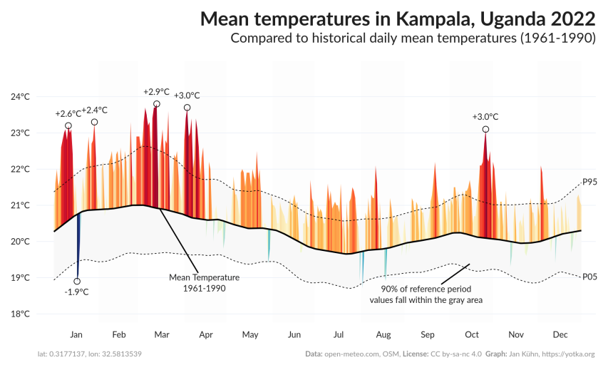
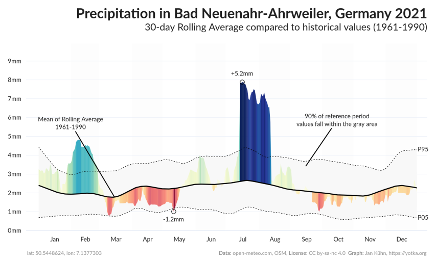
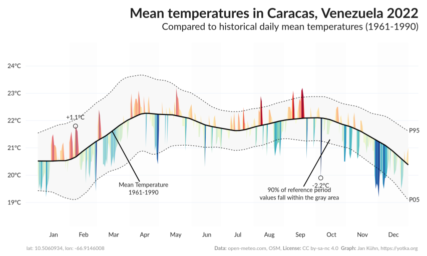
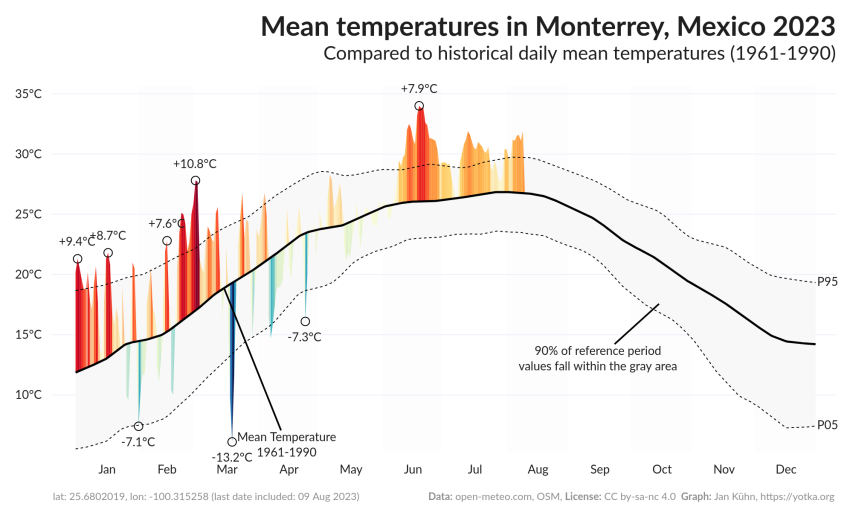
This app allows to create interactive temperature and precipitation (rain, showers, and snowfall) graphs that compare the values of a given location in a given year to the values of a reference period at the same place.
The reference period defaults to 1961-1990 which according to the World Meteorological Organization (WMO) is currently the best "long-term climate change assessment". Other reference periods of 30 years each can be selected, too.
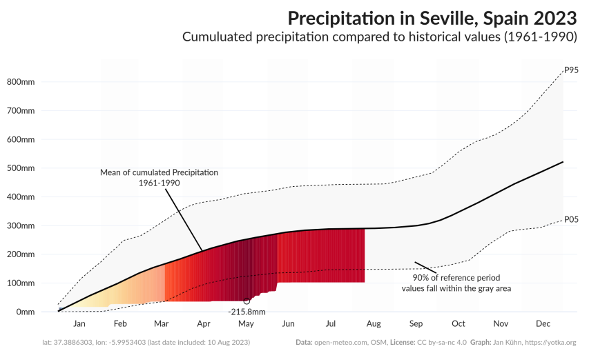
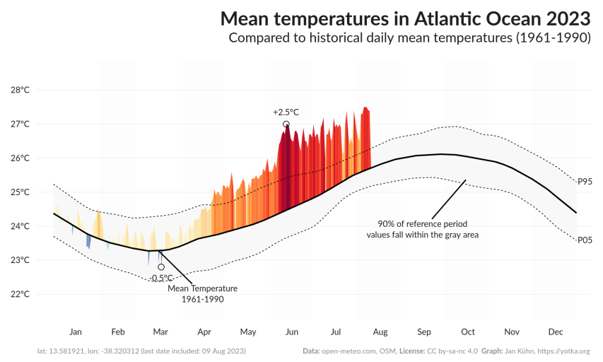
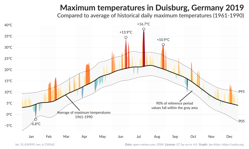
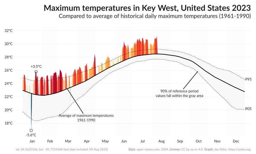
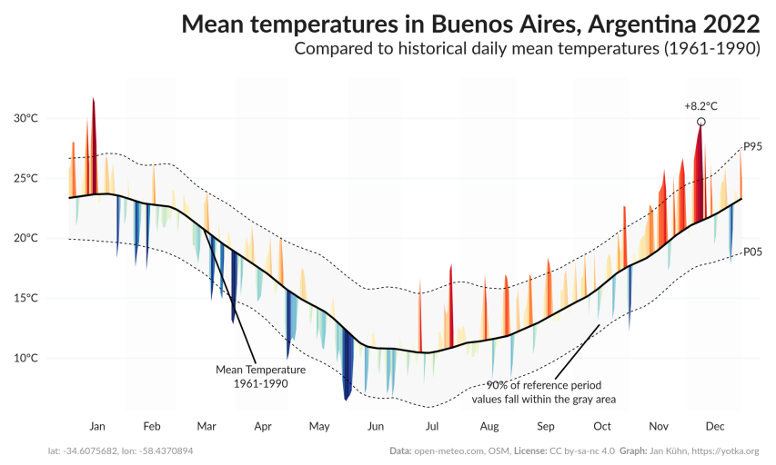
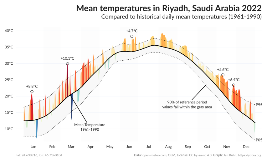
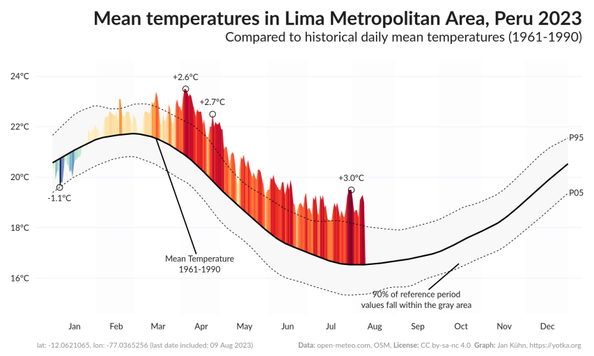
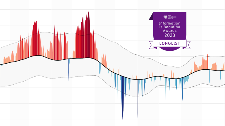
The peaks on the graph show how the displayed year's values deviate from the mean of the reference period. For temperature graphs, this means that the more and the higher the red peaks, the more "hotter days than usual" have been observed. The blue peaks indicate days colder than the historical mean. Precipitation graphs show blue peaks on top which means "more precipitation than normal" and in red "less than normal".
The interactive plot is created using Python's Plotly library. In a first version with static images, Matplotlib came to use.
By default, mean values of the reference period are smoothed using Locally Weighted Scatterplot Smoothing (LOWESS). The value can be adjusted under "advanced settings" in the app.
August 2023: The MeteoHist plot is showcased in the section "Best Python Chart Examples" of Yan Holtz's Python Graph Gallery.
Interactive version
In the latest version (first published on 17 August 2023), the graphs are displayed interactively on larger screens. That means you can hover over the graph and get the exact values displayed for every day. You can also zoom in to see parts of the plot.
Data
To create the graph, data from the open-source weather API Open-Meteo is used. According to them, "the Historical Weather API is based on reanalysis datasets and uses a combination of weather station, aircraft, buoy, radar, and satellite observations to create a comprehensive record of past weather conditions. These datasets are able to fill in gaps by using mathematical models to estimate the values of various weather variables. As a result, reanalysis datasets are able to provide detailed historical weather information for locations that may not have had weather stations nearby, such as rural areas or the open ocean."
The Reanalysis Models are based on ERA5, ERA5-Land, and CERRA from the European Union's Copernicus Programme.
To get location data (lat/lon) for the input location, Openstreetmap's Nominatim is used.
Metrics
Available metrics are:
- Mean Temperature: Mean daily air temperature at 2 meters above ground (24 hour aggregation from hourly values)
- Minimum Temperature: Minimum daily air temperature at 2 meters above ground (24 hour aggregation from hourly values)
- Maximum Temperature: Maximum daily air temperature at 2 meters above ground (24 hour aggregation from hourly values)
- Precipitation (Rolling Average): 30-day rolling/moving average of the sum of daily precipitation (including rain, showers and snowfall)
- Precipitation (Cumulated): Cumulated sum of daily precipitation (including rain, showers, and snowfall)
Settings
- Location to display: Name of the location you want to display. A search at Openstreetmap's Nominatim will be performed to find the location and get latitude and longitude.
- Year to show: Year to be compared to reference period.
- Reference period: The reference period is used to calculate the historical average of the daily values. The average is then used to compare the daily values of the selected year. 1961-1990 (default) is currently considered the best "long-term climate change assessment" by the World Meteorological Organization (WMO).
- Peaks to be annotated: Number of maximum and minimum peaks to be annotated (default: 1). If peaks are too close together, the next highest/lowest peak is selected to avoid overlapping.
- Unit system: Whether to use Metric System (°C, mm - default) or Imperial System (°F, In).
- Smoothing: Degree of smoothing to apply to the historical data. 0 means no smoothing. The higher the value, the more smoothing is applied. Smoothing is done using LOWESS (Locally Weighted Scatterplot Smoothing).
- Peak method: Method to determine the peaks. Either the difference to the historical mean (default) or the difference to the 05/95 percentiles. The percentile method focuses more on extreme events, while the mean method focuses more on the difference to the historical average.
- Emphasize peaks: If checked, peaks that leave the gray area between the 5 and 95 percentiles will be highlighted more.
License
The app and the plots it produces are published under a Creative Commons license (CC by-sa-nc 4.0).
Try it
You can try the app at https://yotka.org/meteo-hist/
Thanks
- This app was inspired by plots made by Dr. Dominic Royé - thanks for the idea and the exchange about it.

