A visualization of the spread of the novel Coronavirus Sars-CoV-2 through Europe
By Jan Kühn, September 2022
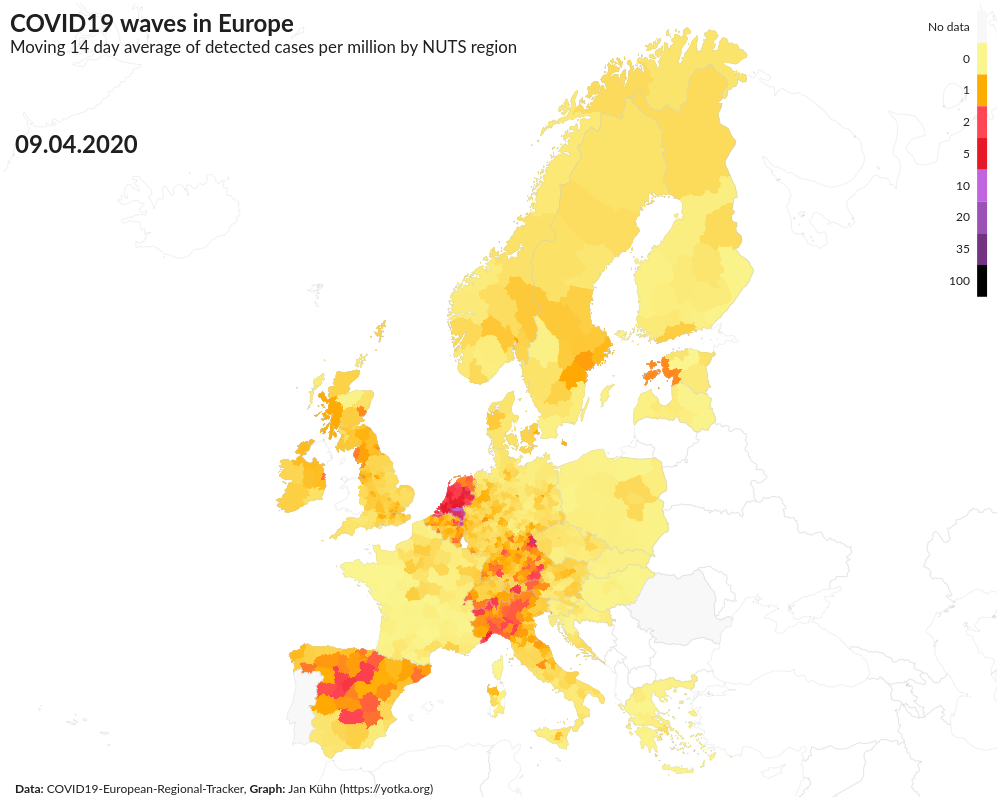
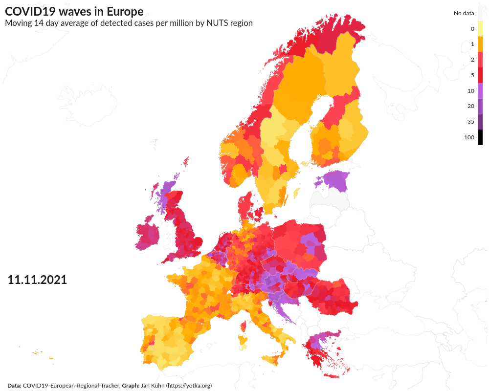
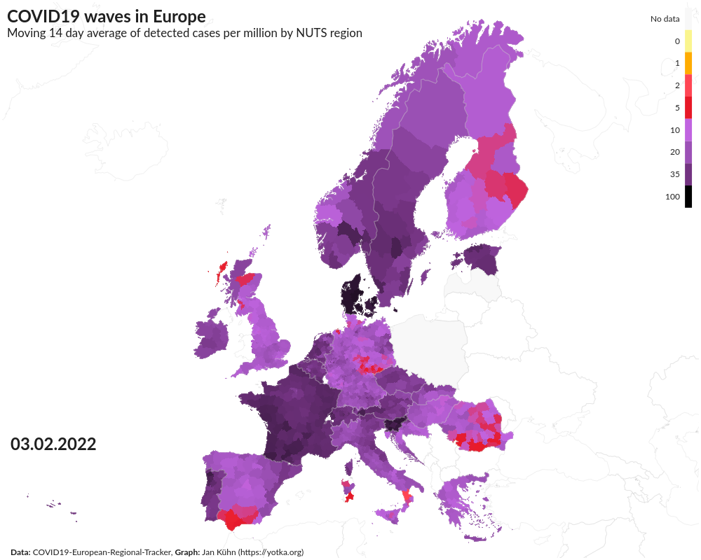
After more than two years of living with the pandemic of the new Corona virus Sars-CoV2 one thing we know for sure is that the virus spreads in waves. But how do they move across a continent – in this case Europe – that has many countries and even more policies to deal with the threat of this new pathogen? I used data to try to answer that question. The result is an animation of detected COVID-19 cases throughout the time period from February 2020 to June 2022.
What I did
- Build an ETL pipeline using Python to extract data from the COVID19-European-Regional-Tracker, a collection of Covid data from many sources by Asjad Naqvi that is adapted to Eurostat's geographic NUTS regions (the so-called "Nomenclature of territorial units for statistics").
- Clean and transform the data with Python Pandas and other libraries to get a clean data set to work with.
- Import geospatial data from Eurostat to combine it with the imported data.
- Create an animated map using Plotly (for Python) with Mapbox to show the development of COvid cases throughout Europe.
Find the code and more about the project on GitHub
Results
One possible result can be seen on YouTube:
See some screenshots below.